iPhone - A very little little detail
There is a Tumblr blog out there -http://littlebigdetails.com that mainly deals with oohing and aahing about Apple’s “awesome” UI and attention to detail. Apple is sometimes good at that, but not that as much as they think they are. Just look at Finder.
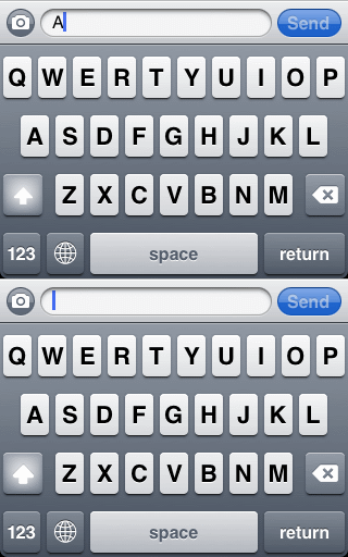
So the other day I found the most useless UI detail in iPhone, and from a quick Google search, not many people found it either. It is a subtle difference in the appearance of the Shift key, depending on whether or not the word is auto-captalised or not. At the beginning of a sentence, it is slightly bolder, than if you were to press Shift yourself.
Below image demonstrates the effect:

You can easily verify this yourself by following these steps:
- Start a new message.
- Type in a letter - say ‘A’.
- Press Shift.
- Type in another letter - say ‘A’.
- Backspace twice. You will notice the Shift key changing appearance when erasing the first letter.
blog comments powered by Disqus
Published
20 June 2011